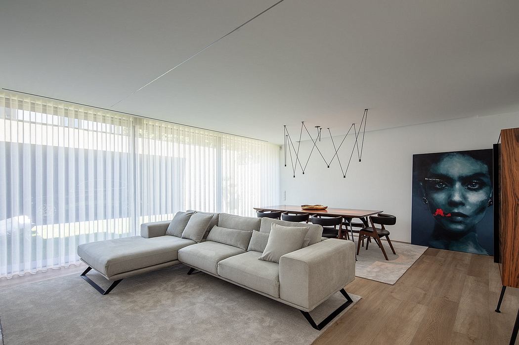
After: ?Coastal Grandma Meets Graphic Designer? Is the Vibe of My New Living Room
Our Lifestyle Editor shares the before/after photos of her living room refresh project with Alex Yeske Interiors. Plus, the full source list of furnishings + decor!
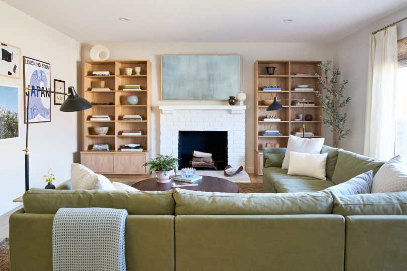
Earlier this week I shared the beginnings of a living room refresh project ? layouts, schemes, mood board, cringey before photos, and all ? and today I?m excited to reveal the final results and dive into all the details with you!
Let?s remember where we started:
Before, I thought I was making fool-proof choices in furnishings by going with neutral everything. I chose white storage cabinets, a leather (re: easy to clean) chaise sofa in a neutral color, no rug (to avoid messy toddler hands and feet), and a modern media console in a beautiful walnut wood. Despite what I thought was logical thinking, it completely backfired because there was no cohesion in design. Plus, safe and neutral actually translated to sterile, boring, and unbalanced ? who knew!" All the while, all the books and toys started to take over the room. It was clear who was king and queen of the household. The lack of division between the two different functional spaces we needed (a space for the adults to unwind and an area for the kids to be kids) made the room feel cluttered and disjointed.
I voiced these pain points to our interior designer, Alex Yeske who drafted up three main layouts. We discussed each of them in depth and I shared what I liked, parts of a scheme that couldn?t work with our current season of life (i.e., sharp m...
| -------------------------------- |
|
|

Villa M by Pierattelli Architetture Modernizes 1950s Florence Estate
31-10-2024 03:55 - (
architecture )