Which Shade of Blue Denotes a Restful Interior
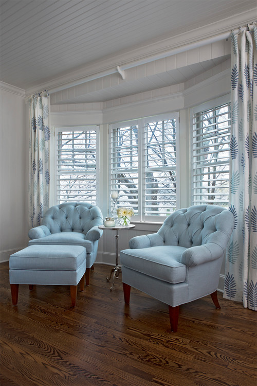
Design by Cottage Company of Harbor Springs
Blue and white are my favourite combination, however as blue comes in many shades and tones, what blue works best if you want to create a restful atmosphere.
As a colour combination, blue, off set by white works beautifully in a coastal or Hamptons style interior where a crisp, fresh look can be achieved, however if you are looking for a serene look, selecting the right tone of blue is imperative. For example, in the two rooms below the first uses a rich, jewel toned blue that's been paired with white and works wonderfully in this seaside bedroom. However, this room has a vibrant, crisp feel to it. The second bedroom on the other hand, appears more restful because of its soft shades of sea foam. There are of course, many shades of blue but if you wish to keep that restful look make sure you tone down your blue to lighter shades of blue/grey, muted blues or serene pale turquoises. Image to the left : Interior Designer Kim Armstrong Image Right: Via Lindye Galloway Interiors
I've selected more beautiful interiors in different shades of blue that promote a restful look. Follow these designers leads and you could have that perfect, blue and white dream space.
Above: Design by Indah Island - This living room has been kept light and airy with white upholstery and blue accent cushions. Small blue and white prints as opposed to large, bolder prints help denote a restful look and allow for use of a slightly stron...
URL:
http://leecarolineart.blogspot.com
| -------------------------------- |
|
|

Villa M by Pierattelli Architetture Modernizes 1950s Florence Estate
31-10-2024 03:55 - (
architecture )