15 Shop Spaces That Put Red to Work

Red is one of my favorite colors to use when something needs a little cheering up. It can brighten a rainy day, make an object stand out, and I?ve never tasted a red fruit or vegetable that didn?t enhance flavor. But it isn?t always used to activate happiness. The color red has a very powerful […]
Red is one of my favorite colors to use when something needs a little cheering up. It can brighten a rainy day, make an object stand out, and I?ve never tasted a red fruit or vegetable that didn?t enhance flavor. But it isn?t always used to activate happiness. The color red has a very powerful psychological duality. It can spark an undeniable optimism and it can also be intimidating and aggressive. Our emotional response to this color is usually dependent on the tone, amount, and context of use. Successful red placement considers balance and how it interacts with other colors. As a primary, we see red everywhere, whether we are conscious of it or not. Think about the beautiful red tones we encounter outdoors ? flowers, soil, rocks and birds. These natural reds lead us to appreciate this type of warmth as something special in our visual experience. Designers often use red as a dominant accent to command attention and when used thoughtfully, the results are instantly breathtaking. I?m sure you?ve heard the phrase, ?pop of color.? If so, it was likely a reference to a red hue that brings something unexpected into view. Red is persuasive, playful and always wants to be the cen...
Red is one of my favorite colors to use when something needs a little cheering up. It can brighten a rainy day, make an object stand out, and I?ve never tasted a red fruit or vegetable that didn?t enhance flavor. But it isn?t always used to activate happiness. The color red has a very powerful psychological duality. It can spark an undeniable optimism and it can also be intimidating and aggressive. Our emotional response to this color is usually dependent on the tone, amount, and context of use. Successful red placement considers balance and how it interacts with other colors. As a primary, we see red everywhere, whether we are conscious of it or not. Think about the beautiful red tones we encounter outdoors ? flowers, soil, rocks and birds. These natural reds lead us to appreciate this type of warmth as something special in our visual experience. Designers often use red as a dominant accent to command attention and when used thoughtfully, the results are instantly breathtaking. I?m sure you?ve heard the phrase, ?pop of color.? If so, it was likely a reference to a red hue that brings something unexpected into view. Red is persuasive, playful and always wants to be the cen...
| -------------------------------- |
|
|
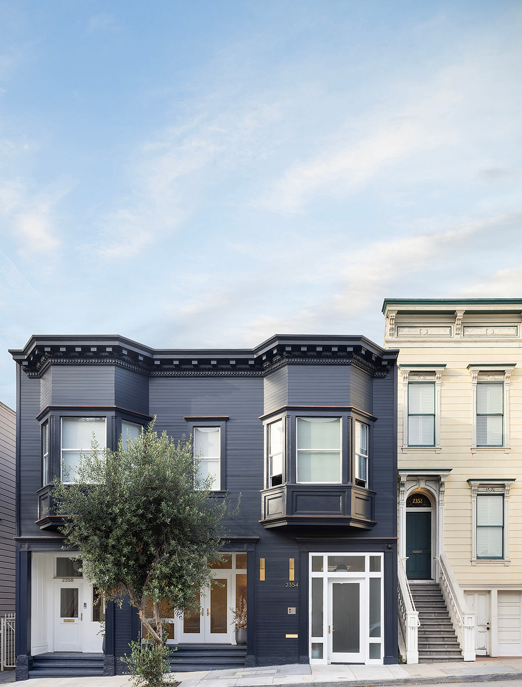
Seven Hills SF: Feldman Architecture’s Airy Workspace Transformation
19-05-2024 05:12 - (
architecture )